date: 2024-11-05
title: Lab-2
status: DONE
author:
  - AllenYGY
tags:
  - Lab
publish: True
Lab-2
Environment Setup
install.packages("BiocManager")
BiocManager::install(c("S4Vectors", "IRanges", "GenomicRanges", "SummarizedExperiment",
                       "BiocGenerics", "Biobase", "BiocParallel", "matrixStats", "locfit", "ggplot2"))
1. Load Dataset
In this step, we load the raw counts and sample mapping data for further analysis.
rawCounts <- read.delim("E-GEOD-50760-raw-counts.tsv")
sampleData <- read.delim("E-GEOD-50760-experiment-design.tsv")
# Prepare countData and colData
countData <- subset(rawCounts, select = -c(Gene.Name, Gene.ID))
rownames(countData) <- rawCounts$Gene.ID

colData <- data.frame(condition = sampleData$Sample.Characteristic.biopsy.site.)
rownames(colData) <- sampleData$Run
2. Differential Expression Analysis using DESeq2
Read the DESeq2 manual for reference: DESeq2 Manual
# Load DESeq2
library(DESeq2)
# Create DESeq2 dataset
dds <- DESeqDataSetFromMatrix(countData = countData,
                              colData = colData,
                              design = ~condition)

# Run DESeq2 to identify differentially expressed genes
dds <- DESeq(dds)
res <- results(dds)

# Summary of results
summary(res)
# Filter and save DE genes by p-value
DE_genes <- subset(res, padj < 0.05)
write.csv(as.data.frame(DE_genes), file = "DE_genes.csv")  # Save as .csv
3. Gene Set Enrichment Analysis
Identify functional enrichment of the DE genes using clusterProfiler and org.Hs.eg.db packages.
# Load necessary libraries
library(clusterProfiler)
library(org.Hs.eg.db)
library(ggplot2)
# Gene set enrichment analysis
gene_id_list <- rownames(DE_genes)
GO_result <- enrichGO(gene_id_list,
OrgDb = org.Hs.eg.db,
ont = "ALL",
pvalueCutoff = 0.05,
pAdjustMethod = "BH",
keyType = 'ENSEMBL')
# Plotting gene set enrichment results
dotplot(GO_result, x = "GeneRatio", color = "p.adjust", showCategory = 10, title = "Gene Ontology Dotplot") +
theme(axis.text.y = element_text(size = 8))
barplot(GO_result, x = "GeneRatio", color = "p.adjust", showCategory = 10, title = "Gene Ontology Barplot") +
theme(axis.text.y = element_text(size = 8))
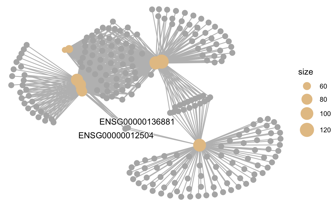
cnetplot(GO_result, showCategory = 10)
Results
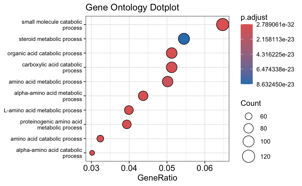
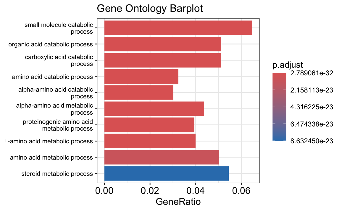
The results of your gene set enrichment analysis (GSEA) for the differentially expressed (DE) genes between tumor and normal samples provide insights into the biological processes that are significantly associated with the observed differences.
The dot plot and bar plot you generated highlight the top enriched Gene Ontology (GO) terms based on the adjusted p-value (p.adjust). The size of each point in the dot plot represents the count of genes associated with each GO term, while the color gradient shows the level of significance, with red representing the most significant terms. In both plots, terms related to metabolic processes, particularly those involved in amino acid and small molecule metabolism, are prominently enriched.
- Metabolic Processes: Many of the significant GO terms, such as “small molecule catabolic process,” “steroid metabolic process,” and “amino acid metabolic process,” suggest that metabolic reprogramming may play a crucial role in differentiating tumor cells from normal cells. This is consistent with the well-known phenomenon of altered metabolism in cancer cells, often referred to as the “Warburg effect.”
- Catabolic Processes: Processes like “organic acid catabolic process” and “alpha-amino acid catabolic process” are enriched, indicating that these pathways might be more active in tumor cells, possibly to meet the high energy and biosynthetic demands of rapidly proliferating cells.
The GSEA results support the idea that tumor cells may have a distinct metabolic profile compared to normal cells, potentially highlighting pathways that could be targeted for therapeutic intervention.
4. Hierarchical Clustering and Heatmap
Apply hierarchical clustering to genes and generate a heatmap.
# Load pheatmap
library(pheatmap)

# Create heatmap
pheatmap(cor(countData),
         annotation = colData,
         cluster_cols = FALSE,
         color = hcl.colors(50, "BluYl"))  # Adjust color for heatmap